

You’ll start by steaming to a glossy, paint‑like microfoam—stop aerating after 1–2 seconds, keep the pitcher touch‑warm, and give it a gentle vortex so the milk stays smooth and clump‑free. Pour a deep base into the espresso to coat the cup bottom, then pull the pitcher close and use a 45° angle for a sharp, high‑contrast design. Switch to an 8–10 oz cup for extra time and a wider view, and transfer the milk to a second pitcher to eliminate bubbles. Follow targeted YouTube tutorials and practice with a metronome to build muscle memory, and you’ll discover even more tricks ahead.
Select a Glossy, Paint‑Like Microfoam Texture for Latte Art Contrast

How can you achieve that glossy, paint‑like microfoam that makes your latte art pop? Aim for a glossy microfoam that looks like wet paint by limiting microfoam aeration to 1–2 seconds at the surface. Stop early to keep the paint‑like texture smooth and avoid clumps. Heat the pitcher until it’s touch‑warm, then finish with a gentle vortex finish so the milk flows evenly and merges with espresso crema integration. This creates a silky milk texture and stable microfoam that holds its shape. Use a larger 8–10 oz cup to extend design time, then execute a near‑surface pour, letting the milk skate across the crema for high‑contrast latte art contrast. The result is a vivid, durable pattern that stands out. Starter kits and complete sets offer helpful accessories like latte art pens and dusters that can aid in achieving precise, high‑contrast results.
Reduce Surface Tension With a Controlled Base Pour
When you pour the base deep into the espresso, you set a solid foundation while keeping surface tension low, which lets the design glide smoothly later. A controlled base pour establishes crema balance and a smooth espresso crema, preventing the microfoam from pushing back. Keep the depth of pour concise—just enough to coat the cup’s bottom—then pull the pitcher closer for the surface pour. This two‑stage approach lowers surface tension, allowing sharper lines and richer contrast in your latte art. Practicing with a 4‑pack of barista towels for quick, lint‑free cleanup can help maintain a pristine workstation and consistent results towel maintenance.
Choose a Larger Cup to Gain Extra Design Time and Smoother Steam

After lowering surface tension with a controlled base pour, you can boost contrast further by switching to a larger cup. An 8‑ to 10‑ounce cup size gives you extra design time, so the milk pattern doesn’t crowd the surface, and it lets the crema stay distinct. The bigger vessel also eases steam control; you can generate smoother, glossy microfoam without over‑working the pitcher technique. Additionally, choosing a cup with a wider opening helps you observe the crema-milk interaction more clearly for precision latte art fundamentals.
Apply an Aggressive Cup Angle and Keep the Pitcher Ultra‑Close During Design
Ever wondered why a steep cup tilt makes your latte art pop? You’ll notice that a 45‑degree cup angle during the design phase gives you a sharper contrast and lets the milk flow glide across the surface skim. Keep the pitcher ultra‑close—just a few centimeters above the espresso—so the two‑phase pour creates a deep base then a crisp, high‑contrast pattern. Slow, gentle rocking replaces rapid wiggles, preserving the control technique and preventing the design from breaking up. This approach also aligns with the concept of precise measurement and data tracking found in well‑equipped brewers, where consistent parameters like temperature compensation and extraction metrics help maintain repeatable results over time. ATC-enabled insights from smart refractometer tools show how stable readings can support you in refining your technique.
Transfer Milk to a Second Pitcher to Eliminate Bubbles and Clumps
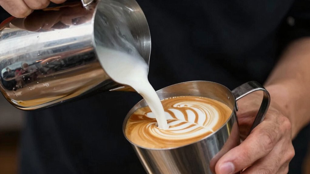
You’ll notice the milk becomes smoother after you pour it into a second pitcher, which knocks out bubbles and clumps. This extra transfer lets you control aeration, giving the milk a glossy, paint‑like texture that enhances contrast.
Though it adds a tiny step, the uniform surface it creates makes your latte art pop.
Pitcher Transfer
Transferring the steamed milk to a second pitcher instantly smooths out bubbles and clumps, giving you a uniform microfoam that behaves like paint. You’ll notice the milk texture become silkier, the surface tension steadier, and the espresso crema stay intact, which boosts latte art contrast. The pitcher transfer lets you execute a smooth pour from the second pitcher, delivering glossy milk that holds fine lines and sharp edges. Practice this step until it feels natural; the extra motion builds muscle memory and lets you control pour height and flow with confidence. Long-handled design also helps reach into tall containers for more precise pours.
Bubble‑Free Milk
Why settle for foam that speckles your canvas with bubbles? Transfer milk to a second pitcher and you’ll achieve bubble‑free milk that lifts your latte art. Start with cold milk, steam to a silky microfoam, then pour into a second pitcher for aeration control. The milk transfer smooths out clumps, creates a glossy surface, and sharpens contrast enhancement. Master this pouring technique to keep milk texture consistent and your designs vivid.
- Use a clean second pitcher to avoid lingering air pockets.
- Tilt the first pitcher gently, letting gravity guide the milk.
- Pause mid‑pour to let larger bubbles rise and pop.
- Swirl the second pitcher briefly to unify texture.
- Practice repeatedly to build muscle memory and speed.
Watch Targeted YouTube Videos for Repeatable Latte Art Contrast Results
Ever wondered how a few well‑chosen YouTube tutorials can turn your latte art contrast from hit‑or‑miss into a reliable routine? You’ll find that targeted videos break down latte art contrast into three visual cues: milk texture, microfoam consistency, and espresso crema depth. One tutorial shows a perfect two‑phase pour—start with a steady base pour to set surface tension, then hover for the final swirl. Another focuses on steaming to avoid over‑aeration, keeping the milk glossy and the microfoam smooth. By watching these YouTube tutorials, you internalize timing, volume, and the subtle tilt that creates repeatable results. Apply the demonstrated pouring technique on an 8‑oz cup, then transfer the skill to smaller sizes for consistent contrast every time. Latte Art Fundamentals guide you to align steps with your espresso shot characteristics for more predictable outcomes.
Practice Like a Conductor: Muscle‑Memory Drills for Perfect Contrast
After watching the tutorials, start treating each pour like a conductor’s baton, turning deliberate hand motions into muscle‑memory drills that lock in sharp contrast. You’ll notice how a steady pour‑ technique, a deep base that sets surface tension, and a close‑to‑surface finish create the bold lines you crave in latte art. Keep your steam milk texture glossy by limiting air to just a second or two, and use a larger cup at first to give yourself timing room before trimming down to 4–6 oz pours. Practice the two‑pour technique daily, focusing on the first deep pour then the finish stroke. Time each motion with a metronome to embed muscle memory. Mime favorite video motions before actual steaming. Adjust surface tension by varying the cup angle. Keep milk texture smooth, avoiding excess foam. Surface tension guides and stabilizes the pour for sharper contrast.
Frequently Asked Questions
What Is the Secret to Perfect Latte Art?
You create perfect latte art by steaming milk into a glossy, paint‑like microfoam, pulling a stable espresso shot, then using a two‑phase pour with precise 45‑degree alignment, keeping the stream pencil‑thin.
What Are Two Ways That Contrast Can Be Increased?
You can boost contrast by pouring less base to lower surface tension, letting sharper edges form, and by using a larger cup so the design spreads longer, creating clearer milk‑espresso distinctions.
What Are Common Latte Art Mistakes?
You over‑aerate milk, making thick foam; under‑aerate it, creating thin, runny microfoam. You pour too much base, tilt the cup wrong, or start without a plan, causing blurry, jagged designs.
How to Make Latte Art More Defined?
You sharpen definition by pouring steady, thin streams, keeping the cup tilted, using glossy micro‑foam, and pulling the pitcher smoothly to create crisp edges without bubbles or over‑aeration.
In Summary
By mastering these seven contrast‑boosting tricks, you’ll turn ordinary lattes into eye‑catching canvases. The glossy microfoam, precise pour, and right cup give you a clean canvas; aggressive angles and ultra‑close pitcher control the design; a second pitcher eliminates bubbles; targeted videos sharpen your eye; and focused muscle‑memory drills lock in consistency. Keep practicing, and every cup will showcase striking, repeatable contrast that wows every customer.


